Citymapper's Search Results, Product Feedback
November 04, 2017
Update 9/11/17: Citymapper’s head of mobile liked the feedback, having call tomorrow.
Update 10/11/17: Turns out Joe is the engineering lead for the web and mobile clients. He said that the post had been passed round the product team! I’ve been invited to meet them.
Update 23/11/17: I had a confidential chat with the Citymapper team and it was awesome to meet all of them. They’re super passionate about the future of urban travel and an awesome mix of data-driven/product-driven.
Hey Citymapper,
Been a big user since I saw V2 on the App Store.
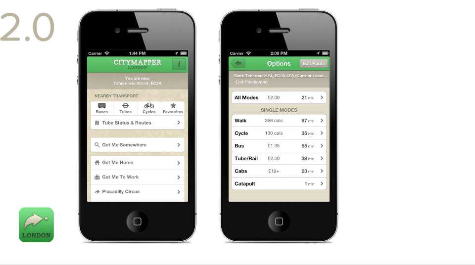
You guys smashed it, prior to Citymapper there was no consensus on the best app for London transport. I’d have separate apps for tubes, buses and bikes and it was a big mess.
So in advance, thank you, getting around London is now super easy and I wouldn’t want to risk sounding unhappy when everything is amazing.
But the other day I was going for KFC with my friend Alex nearby Camden and I felt I had to give some feedback on your Search Results UI/UX.
User Story
- User opens Citymapper, User presses Get Me Somewhere.
- App transitions to Search Screen (List View)
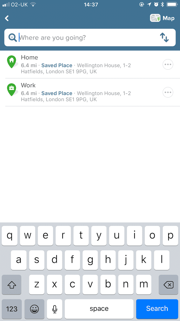
- User enters Search Query
- User presses “Show on map > ”, app transitions to Map View (with my location blocked out)
- User wants to go back to the search screen to amend their search query
Steps 4 and 5 are where the issues are.
1. User opens Citymapper, User presses Get Me Somewhere.
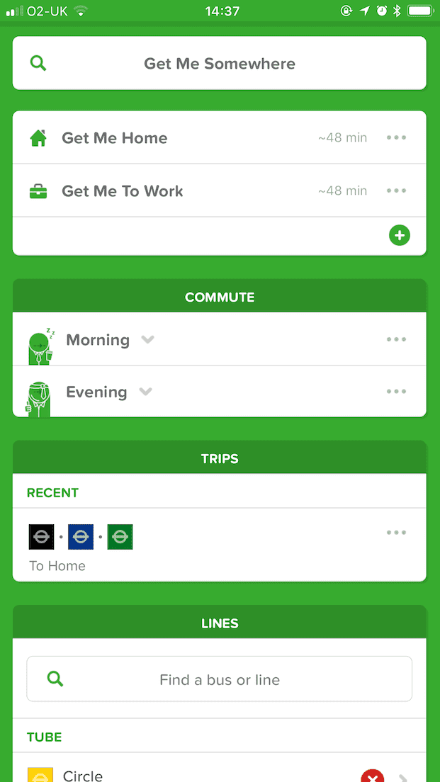
2. App transitions to Search Screen (List View)
Ok cool, User wants to go to a KFC in the Camden area so searches…
3. User enters Search Query
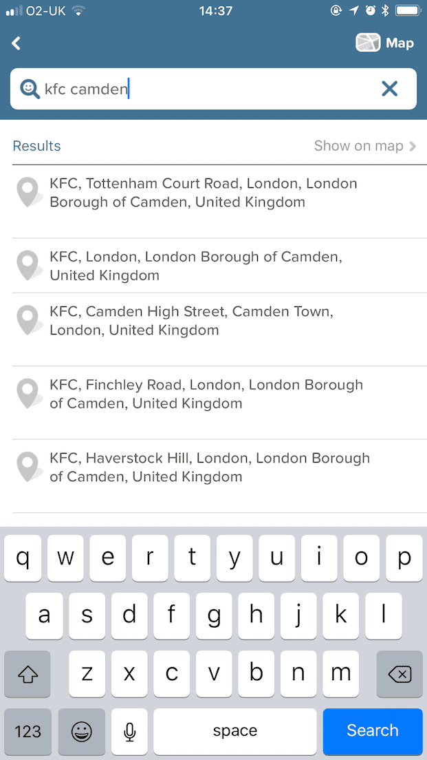 User looks at the results and wonders “I wonder which KFC is the closest to my friend Alex”
So the user presses Show on map >
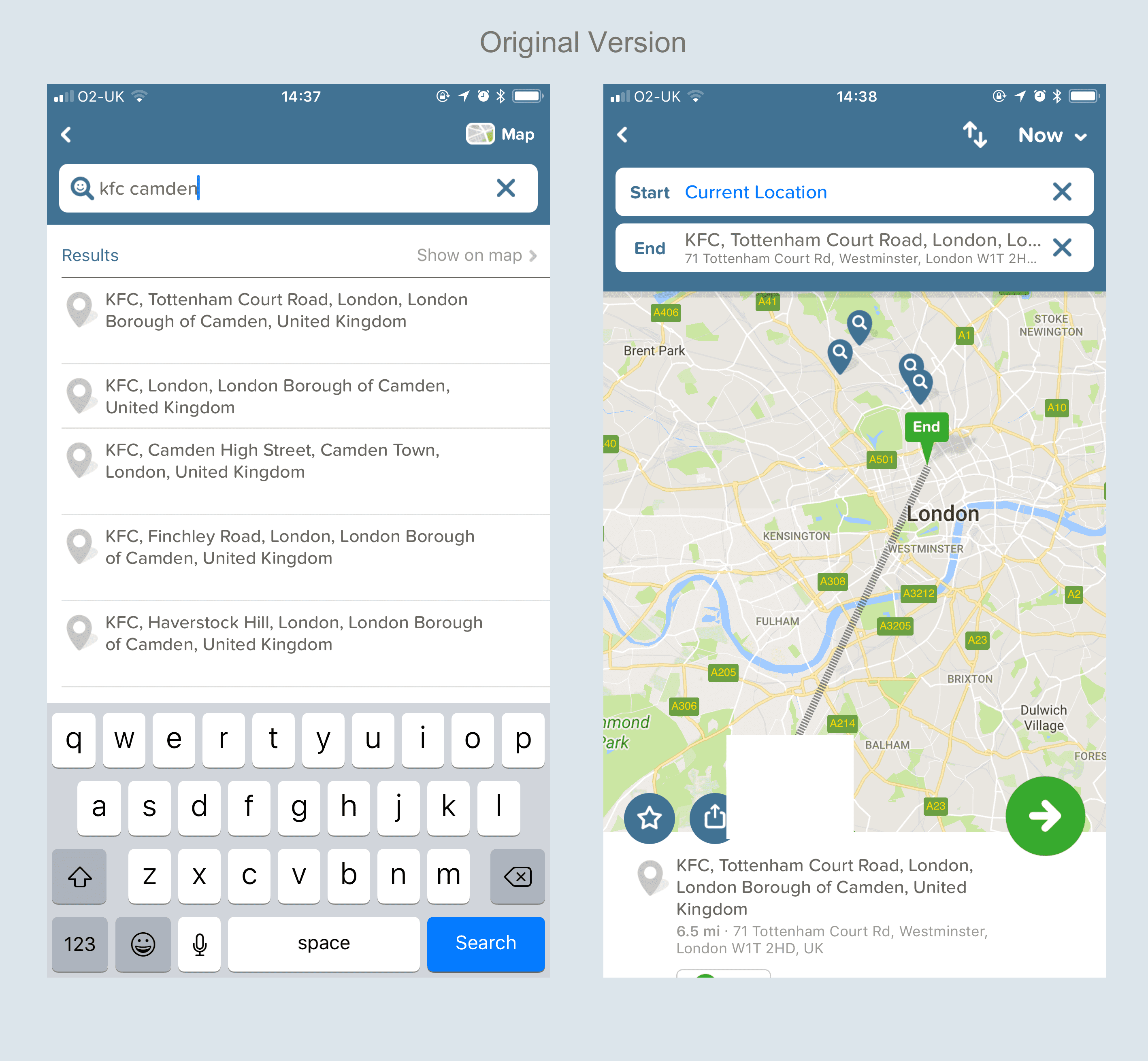
4. User presses Show on map >, app transitions to Map View (with my location blocked out)
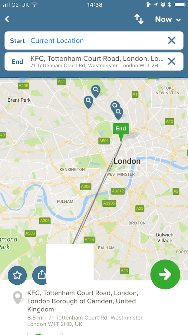
Three things that would be cool here:
a. Use of colour to differentiate between the UI
b. Some connection between the Map View and the List View
c. Bring attention to the user that you’ve auto selected the top result.
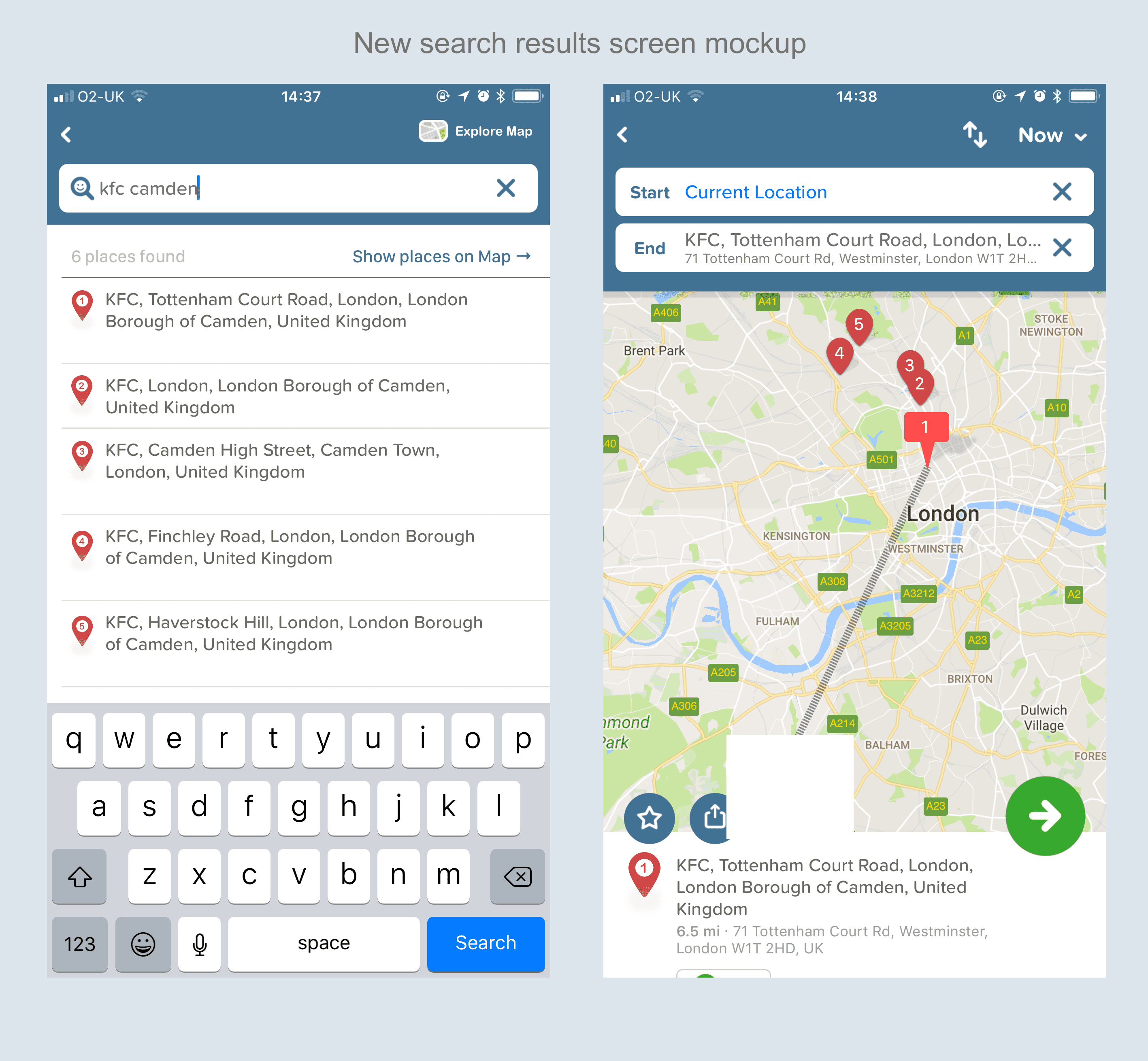
a. Use of colour to differentiate between the UI
Having a different colour for the map pins would be ideal, and Apple is here to back me up too:
Use expected pin colors. A pin identifies a point of interest on your map. People are familiar with the standard pin colors in the Maps app. Avoid redefining the meaning of these colors in your app. Use red for a destination, green for a starting location, and purple for a user-specified location.
Apple Human Interface Guidelines - Views - Maps
In addition to the map pin colours being different to what user’s are used to in other mapping apps, they’re also the same colour as “Action” buttons on bottom of the UI. Having these be different would add some visual clarity.
b. Some connection between the Map View and the List View
How about numbering the results in the List View and having those numbers on the pins in the Map View.
c. Bring attention to the user that you’ve auto selected the top result
You’ve chosen to auto-select the top result as the user’s destination. They didn’t ask for this, they clicked “Show on map”, I appreciate that it might be helpful some of the time, but it’s an action that the user never did themselves.
In the mockup below
Mockup showing changes a,b,c
Mockup of these changes, apologies in advance for not being pixel perfect:
Old version for reference:
Carrying on in the user story…
5. User wants to go back to the Search screen to amend their search query to “KFC Mornington Crescent”
What would you press?
Apple:
“When a new screen is displayed, a back button, often labeled with the title of the previous screen, appears on the left side of the bar. ”
Apple Human Interface Guidelines - Bars - Navigation Bars
Citymapper:
Arrows in orange indicate current navigation, yellow indicates what a User is used to:
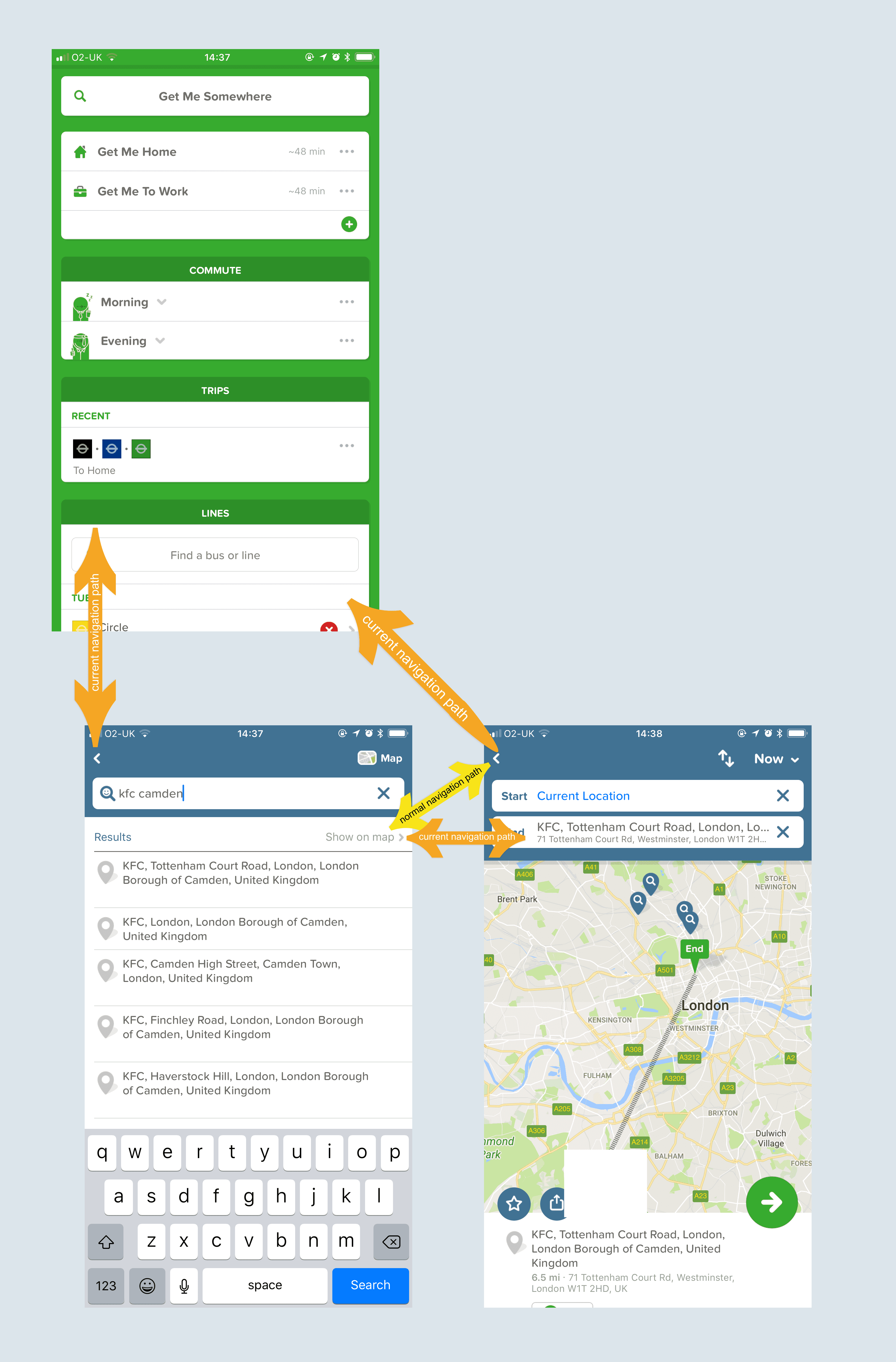
Perhaps my suggested change breaks another navigation pattern in another part of the app. But perhaps review the current pattern/layout.
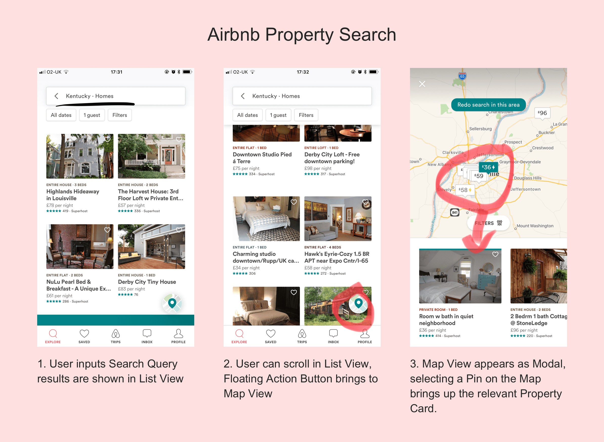
Airbnb have quite a nifty one:
I don’t really have a qualified opinion since I don’t have your analytics data, but I’d be interested in how many users:
Search → Press Show on Map -> Press the Back Icon bringing them to the Home Screen → Do the same search again.
—
Thanks again for a great product, and hope you guys see this.
Thanks for reading! If you have any comments, questions or feedback please get in contact. Have a nice Sunday.
I'm Henry Moulton, a software design and development freelancer living in London, UK.
My portfolio will be online soon.